So, I’ve had an idea that I think is good enough to make into a full side-project. It’s nothing super technical, it’s not a million-dollar idea, but it’s something fun that I think could have an impact on my community. Without giving the specific idea away, it’s a website that involves playing music in some way.
To start with, I feel like design will make or break this project. The idea isn’t super unique – people can play music on their phones, laptops, tablets, smart speaker, etc. I need a great design that will encourage users to come back. In past projects (especially in college), the visuals are definitely put in the backseat. For example, our first year project was entirely command-line based and our second year project (which I’m incredibly proud of and cost a lot of blood, sweat and tears) isn’t exactly cutting-edge. But these days, I feel like design is more important than ever. Personally I see this with music streaming – I don’t use Tidal because it’s so ugly, and I don’t use Apple Music because of design choices to remove features to make it look pretty (e.g. not having an album collection on an artist’s page and 1,000 other tiny things). What I’m trying to say here is that for my project at least, a pretty and functional design is crucial.
With that in mind, I wanted to have the design roughly sorted out before I went ahead with any coding. I decided now was the time to give Sketch a try. There’s a 30 day free trial, followed by a 50% student discount so I’m giving it a try. From what I’ve seen so far, it’s super easy to use and has a load of great features. I’m not an expert by any means, but after a few hours of usage, I think I know what I’m doing with it. The documentation seems really great too (especially compared to what I’ve seen of Adobe’s documentation). The price is pretty great too compared to any competitors I’ve seen – $49/year if you’re a student, but if you don’t renew the subscription, you can keep the app, which I think is amazing.
Anyway, last week I downloaded Sketch and started messing around. My website will be showcasing small Irish musicians, so I thought I’d use my friend James Bentley as a starting point for mock-ups. I want the website to be minimalist and pretty, so I threw a few shapes on the screen, and this is what I came out with at first.
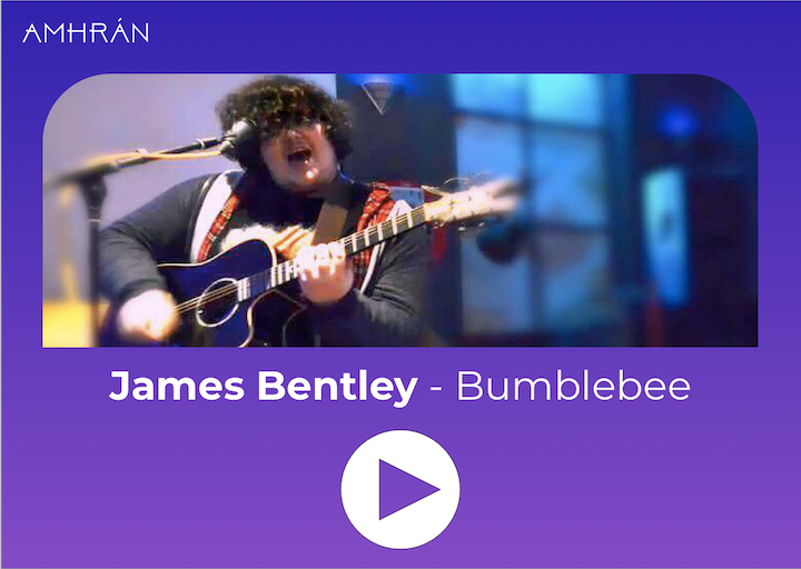 Not bad… I think
I definitely want to have the picture front and centre and I think it looks good… but I didn’t think it was quite there yet. I decided to look for inspiration (basically I googled “music good web design”). I saw something that reminded me of the surprisingly-great Shazam app, which I think definitely inspired me.
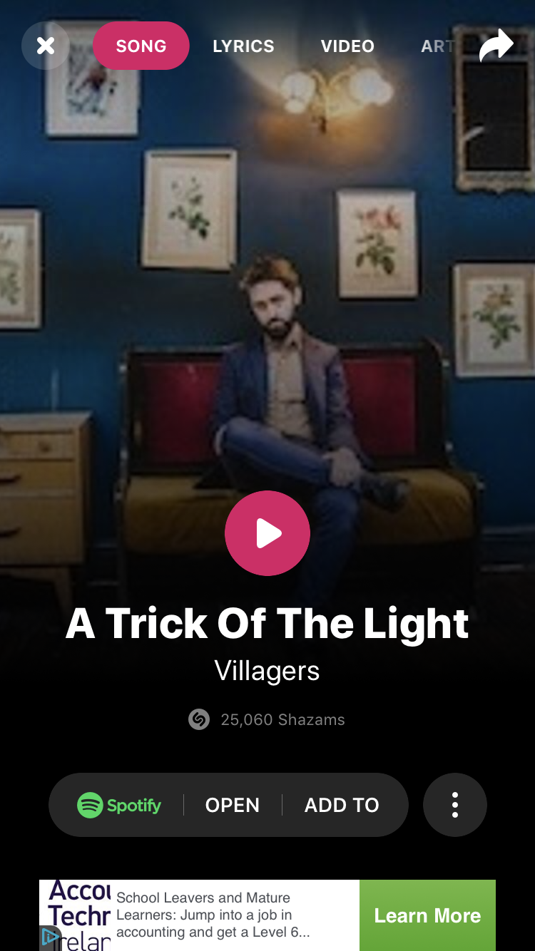 Even though the background image is low-res, it’s still so pretty
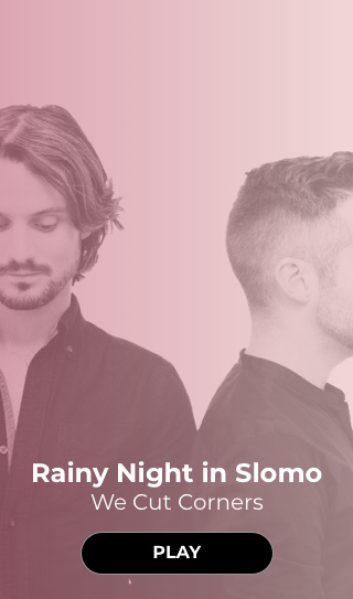
I’m a big fan of full-screen images for music, ever since back in Android KitKat’s lockscreen. I just think it looks pretty. Anyway from there, I just came up with a few more ideas – this time with We Cut Corners as my placeholder.
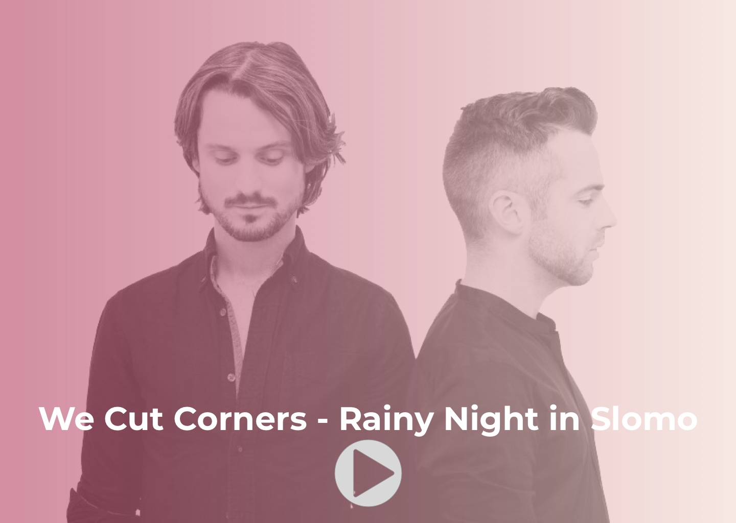 Original concept
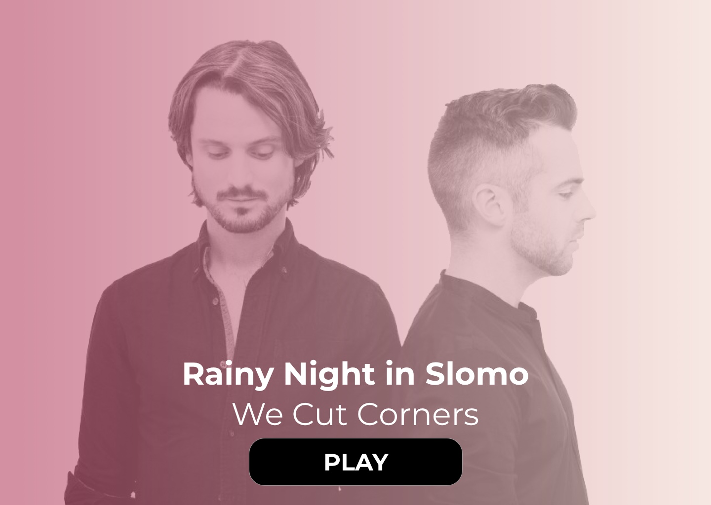 Played around with font and a nicer button
 Mobile layout
This is kind of whee it’s at now. I put a pink gradient over the image, which I can do easily with CSS and possibly randomise depending on the template image. I think I’ll pop in a black gradient like in Shazam – it looks super slick. I realised earlier tonight that I won’t be able to use a play button like that though for copyright reasons – chances are, I’ll need to embed Spotify/Soundcloud/Bandcamp music instead. I’ll see it how it goes.
Overall, I’m pretty happy with how the design looks. I’ll finalise it soon and then get to actually coding it up (which shouldn’t be too bad at all!). I feel like now that I know what this will look like, things will be much easier. Well, here’s hoping.